Sneak Peak Colour Trends for 2017
- Sep 28, 2016
- 5 min read
Every year and in fact every season of every year - Pantone release THE colour trends for the season. Before I divulge the must have's which they have predicted for 2017 - I thought it might interest some of you on the history of Pantone and how their colour predictions come about. (Those not interested skip to pictures)!
Pantone developed the first colour matching system in 1963, at this stage it consisted of a large number of small cardboard sheets, printed on one side with a series of related colour swatches and bound into a booklet of sorts. This system was referred to as the Pantone Matching System. By standardising the colours, any manufacturer in any location can reference a Pantone numbered colour which will then allow designers to 'colour match' specific colours when a design enters the production process. This system was widely adopted by graphic designers and reproduction and printing houses and is still used today to specify colours all be it now for a much wider range of industries. The most commonly referenced colours are in the Pantone solids palette which consists of 1,114 colours, identified by three or four digit numbers, followed by a C, U, Or M suffix. Check it out http://www.pantone.com/color-finder
The Pantone headquarters are based in N.J, a 75,000-square-foot factory which produces colour, well more accurately, 10,000 hues of colour. Here, dozens of white-coat lab techs spend their days mixing dyes for the fashion and home textile industries, and testing shades of ink for brands ranging from KitchenAid to Sephora. A select few of those shades go on to become the prestigious Colour of the Year, a marketing initiative which was implemented by Pantone in 2000 that has since evolved and become a significant cultural and media event for both consumers and brands worldwide:
"The complexity of the logic behind Colour of the Year is greater than interior design or fashion - it's a forecast, a reflection of what's happening in the world." Ron Potesky, senior VP and general manager at Pantone.
In keeping with this tradition, Pantone have released the top ten colours for spring 2017, featuring the top 10 shades seen on the runway, the PANTONE Fashion Colour Report is your essential colour guide to the season. As my fashion sense can sometimes be described as basic - let’s take a look and get ahead of the game #maybe2017willbemyyear
The colour predictions for 2017 are described perfectly by Leatrice Eiseman, Executive Director of the Pantone Colour Institute, she says: "Reminiscent of the hues that surround us in nature, our Spring 2017 Fashion Colour Report evokes a spectrum of emotion and feeling. From the warmth of sunny days, to the invigorating feeling of breathing fresh mountain air and the desire to escape to pristine waters, designers applied colour in playful, yet thoughtful and precise combinations to fully capture the promises, hope and transformation that we yearn for each Spring."

Primrose Yellow - 13-0755 - a joyful yellow shade reminding us of bright summer days, it is enthusiastic, full of good cheer and sparkles with heat and vitality.


A brilliant accent colour - Primose Yellow looks great as the paint colour on the Ikea bookshelves bringing in some fun to a bare wall. It also creates a dramatic feel to this dining room making for a fabulous contrast but also bringing warmth in to the space.
Pink Yarrow - 17-2034 - A bold, attention seeking, captivating and stimulating colour (we've all got that one friend we can relate this too)! A tropical burst that really that can't help but lift your spirits.

Case in point I would say?! Wooo naughty and uplifting!
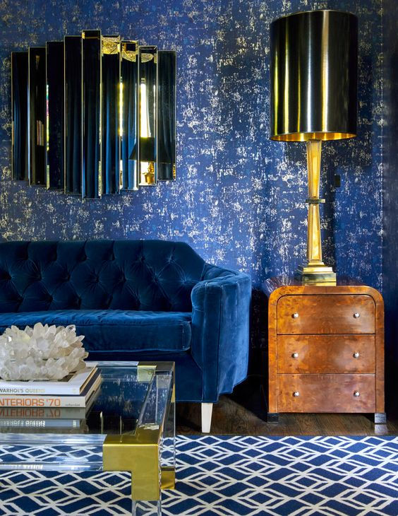
Lapis Blue - 19- 4045 - A strong, confident and energetic Blue - whilst dramatic its important to remember that blue is a calming colour - don't be sacred people, be bold, be daring, be lapis Blue.
Ok, I didn't ease you in with that - an eccentric and bold example but you know you all want to be sitting on that sofa with a G&T and a salted almond?! Otherwise you could just accessorize like the below:

Pale Dogwood - 13-1404 - A subtle pink with a healthy glow - it is a soft, peaceful and feminine colour. Light, airy and innocent as seen in the example below - a great bedroom colour too - similar to the blush that has been so popular this year.

Kale - 18- 0107 - Almost instantly connecting us to the outdoors with the need to do a military boot-camp or a lunge, it seems this super-food will make its way from the shelves of Wholefoods to your house one way or another, not just a phase Kale is here to stay - a rich, dense greenery that will breath oxygen into your interiors. I am sold and know I will instantly prefer the Kale on my walls than in my blender...


OOoooo - just delicious!
Island Paradise - 14- 4620 - As it says on the tin - think Caribbean, coconuts and cocktails, a tropical setting, a cool blue green shade that speaks of that dreamy paradise getaway that we all wish we were on * cough cough honeymoon*.


Flame - 17 - 1462 - A red based orange colour that is passionate, fun and Flamboyant - a free spirit, adding warmth and a bit of fire to your spaces!

Go full throttle - like with that waiter in your gap year.
Or just dip your toe in with a wee a splash...

Niagara - 17- 4123 - This is the dominant colour for the Pantone Fashion Colour Trend, like a comfortable pair of jeans this is a reliable, dependable colour, its a classic, calming and easy to use in a number of spaces whether as an accessory or as a wall cover - hard to dislike.


Greenery - 15- 0343 - Like a healthy green smoothie first thing, invigorating, refreshing and a little bit zingy a yellowy green that is full of energy and definitely projects those springtime vibes.


ZING!
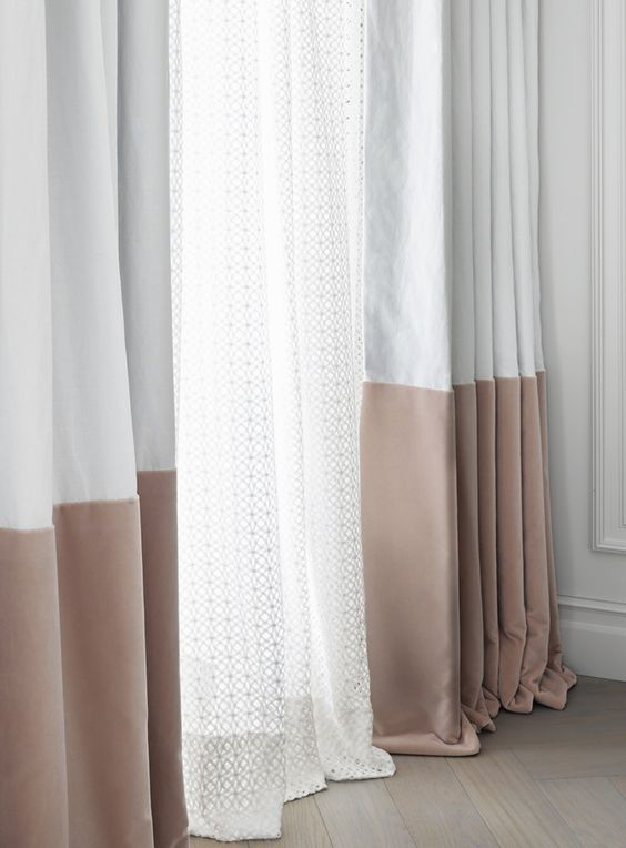
Hazelnut - 14- 1315 - A warm and earthy neutral which is unassuming and effortless - this will be a key neutral for the spring, easy to use in its entirety or sporadically - think Kanye definitely got the memo on this one! For interior inspo - Kelly Hoppen has the neutrals bang on.

Kelly Hoppen has created a Hazelnut Dream here - very serene.
If that is not for you she has also used another example of just a Hazelnut panel on some neutral curtains. I love how she combines something so simple with a slightly more decorative sheer - making it really feminine and more of a feature.
Hope this sets you up with some ideas for next year with Pantone's hints of the on trend colours for 2017. Get in touch if you have any Interior Questions I can help with or send across your Interior pictures if you have decided to be bold and mix things up ...
*Big shout out to Pinterest for the photo inspiration...


Comments